Project 2
Overview:
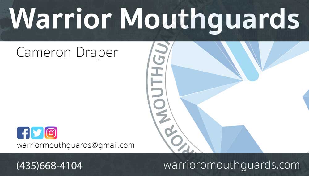
- This week I wanted to explore creating a business card. I found myself floundering trying to remember some of the trick to create a fluid image. I used the logo I had and stretched it out so it took up half of the card, I wanted the logo to be prominent so people could recall it when they see it again. I used semi transparent boxes on top and on bottom to create a uniform feel, as well as used Sukhumvitset bold and thin fonts to make a contrast between the brand name and my name under it. I also aligned my name with the social media icon, gmail and number to get a hard edge that is inset from the title. The .com name is right aligned to complete the card.
- This was an interesting project as I needed to go through and relearn how to make clipping masks. I also used transparency on several items to help make things look faded and not so hard. I also added an effect on the top and bottom to make the image pop, I faded the image but you can still see the effect.
