Project 2
Overview:
Credit for images:
Scuba Diver :https://upload.wikimedia.org/wikipedia/commons/8/8a/Discover_Scuba_Diving_--_St._Croix%2C_US_Virgin_Islands.jpg
Under_Water: https://cdn.shopify.com/s/files/1/1003/7610/products/Ocean_underwater_with_coral_reef_Wall_Mural_Wallpaper_a.jpg?v=1578614189
Logo: https://www.adventure.plus/
Tools Used: Clipping Mask, Quick Select, Inner Shadow, Inner Glow, Outer Glow, Channels Paths, Smart Objects, Text.
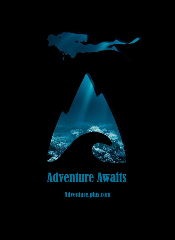
- This project I focused on simplicity and a feel of the mysterious. Adventure Plus is an outdoor recreation shop that has guided tours and classes in scuba diving, canyoning, paint-balling and other various activities. I wanted to focus on the Scuba Diving aspect for this magazine page. I love scuba diving and I the image in the background is what I see every time I go under the water. I wanted to bring that fear/excitement of exploring something new.
- I was worried about creating this image as I was going with a simplistic design. I wanted to create the feeling that to get to this sacred place you would need to go through Adventure Plus to get there, That is why I used the fx to create that poking a hole through the image to see beyond. To create this image I used a picture of a lone scuba diver, I used the channels to select an image that had a lot of contrast so I could then I used the quick selection tool to grab the image I needed. I then filled the image with black so I could transpose it onto the sheet I was using. The logo of Adventure Plus was an image I got from there website, unfortunately the image was extremely small and I had to use Illustrator to expand the image and clean it up. Once I had my images placed I played with the scale and placement until I found what I was looking for. I then grabbed in underwater image and created a clipping mask to set the image behind my items. I ended up using the same image twice to create the sense that the water was deeper then what was on the original image, Because of the light flow I found that it made it look more natural as well. Once that was done I played around with a few text and fonts until I found one that felt right. I aligned everything center to help with the flow and draw your eyes down to the website.
Credit for images:
Scuba Diver :https://upload.wikimedia.org/wikipedia/commons/8/8a/Discover_Scuba_Diving_--_St._Croix%2C_US_Virgin_Islands.jpg
Under_Water: https://cdn.shopify.com/s/files/1/1003/7610/products/Ocean_underwater_with_coral_reef_Wall_Mural_Wallpaper_a.jpg?v=1578614189
Logo: https://www.adventure.plus/
Tools Used: Clipping Mask, Quick Select, Inner Shadow, Inner Glow, Outer Glow, Channels Paths, Smart Objects, Text.
